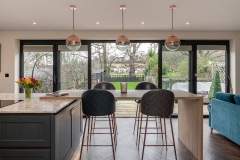
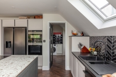
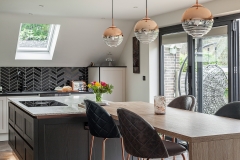
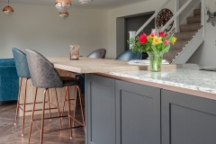
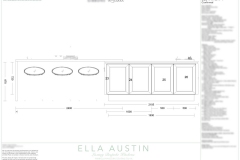
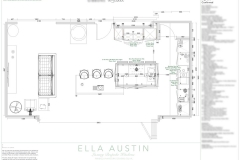
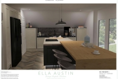
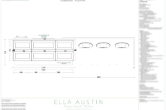
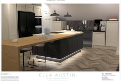
Another project working in closely with SA Property Services – full renovation specialists who were tasked with substantial internal alterations based around a completely revamped kitchen and utility area. Together with SA, we re-designed the kitchen/utility space as there were various factors that simply didn’t work for the clients.
Firstly, the existing kitchen largely consisted of a mass of drawers throughout – something that may look aesthetically pleasing but in reality doesn’t work when storing things like glasses and glassware, clunking and knocking against each other every time the drawer closes.
The original island layout and design was also cramped and needed to be reconfigured to suit our clients individual needs.
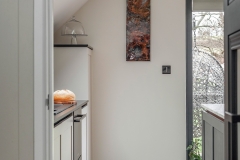
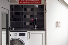
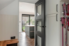
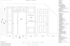
Secondly, and perhaps the most important factor in this project was to increase the size and functionality of the utility room. Originally only big enough to squeeze in a washing machine, boiler, and minimal storage space, the room benefits from a frequently used external side door so we needed to provide enough space for this couple’s much loved Russian Terrier to be hosed down and dried after a long muddy walk in the country, as well as somewhere to sit to take off boots, plus maximising as much storage as possible.
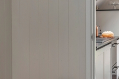
The first step was to reconfigure the internal wall between the kitchen and utility – we lost around a metre in the kitchen (to be gained in the utility room) so the big task was to keep vital kitchen storage space with this new smaller footprint. Another obstacle to contend with was the substantial angled ceilings which take up what would usually be a prime location for wall mounted cupboards, so something else to had to be clever with when re-designing the space with storage in-mind.
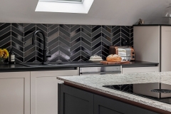
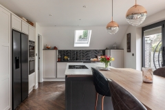
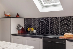
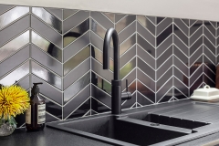
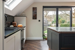
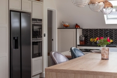
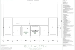
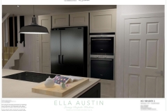
We opted for mid-height studio larder cupboards – 1x shelved for storing crockery and the likes, and the other featuring pull-out and door mounted storage. Further base cupboards surround the new black composite granite sink (with black Quooker Flex tap and complimentary black strainer wastes), and a new freestanding Fisher & Paykel Double DishDrawer, in black finish to match the clients existing american style fridge freezer.
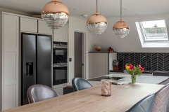
Adjacent full-height tall storage units provides further general shelved storage, stacked Siemens ovens surround the fridge freezer, with bridging double topbox above.
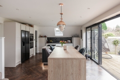
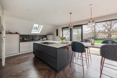
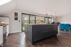
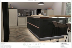
We rotated the island 90 degrees so the full view of the garden could be seen when preparing meals. Another previous issue was the big overhead extractor, getting in the way visually as well as causing multiple head bumps! Therefore we designed the new island with a surface mounted Bora Pure vented hob – taking away all the previous overhead issues.
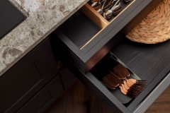
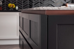
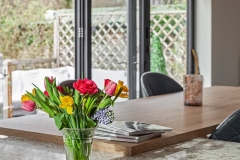
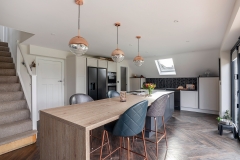
Hidden bespoke internal cutlery drawers in the 2 outer most pan drawer units, with the handleless rail profile continuing around the whole island, and finally with a raised feature Natural Anthor Oak breakfast bar.
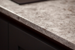
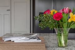
The perimeter cabinetry features a lovely subtle painted Shell finish with leathered black Granite worktops and graphite handleless rail, and a negative effect on the island – dark Graphite cabinetry with light but striking Verona Verde Quartz worktops and constrasting copper handleless rail.
Photography by Malonda Photos


