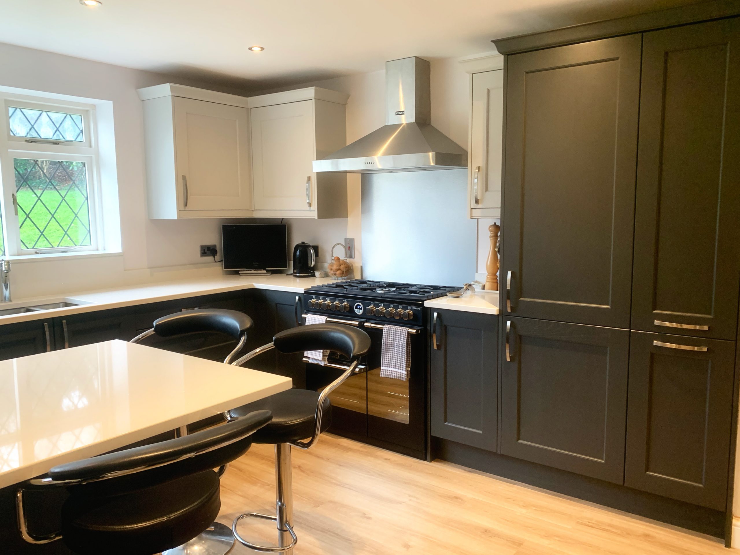
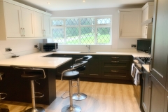
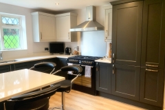
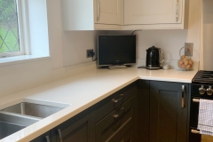
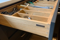
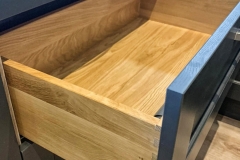
A very popular colour combination for a very popular classic kitchen range, our Wakefield is a lovely traditional painted timber shaker with internal centre-panel beading, giving it a little something extra.
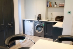
The brief was to create an open plan kitchen-utility. Originally separated by a dividing wall, the utility was crampted, dark and quite underwhelming so the task was to open up and have a kitchen with a dedicated utility zone that was not only practical for busy family life but also attractive enough to be constantly on show.
The original kitchen was not only dated in style but there were a few key elements that didn’t work for this sociable young family. The limited seating area was compromised as the small undercounter fridge was in the way, meaning realistically only 3 could be seated at a push. There was also one laundry appliance in the heart of the kitchen and the other in the utility. Whilst there wasn’t a huge amount to change in terms of the general footprint, the task was modernise everything, correct what wasn’t working with the original design, combine the open plan kitchen/utility zones, plus introduce some clever storage solutions.
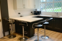
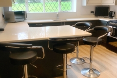
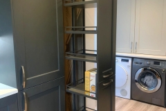
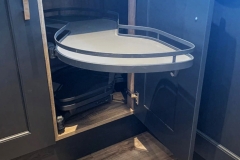
The original breakfront built-under single oven was replaced with a streamlined range cooker and matching extractor hood. We intregrated a tall fridge freezer next to the new tall pull-put larder for tons of accessible dry food storage. Two large corner cupboards (one with LeMans pull-out) maximise storage options, plus a re-configured double-sided peninsula breakfast bar allows enough seating for everyone.
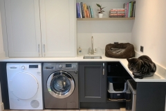
The utility area needed to provide functional space for the laundry, separate smaller sink, a place for the family cat and accompanying necessities and bespoke boiler housing. We also designed a shallow breakfast bar type area for hiding the existing freestanding bins out of sight.
Full renovation works were carried out by our recommended and trusted 3rd party contractors, including full rip-out, plastering, electrics, plumbing and flooring.
